We commonly need to debug an implementation of a new cloud component. While a torrent of error messages in the system logs communicates the fact that the experiment did not work the way it was intended to, it is harder to determine exactly why this is the case. This becomes especially bad when the cause isn’t a simple programming flaw, but an issue with the scheduling logic or algorithm itself.
A recent example for this was a scheduler which uses machine learning techniques to enforce SLAs, i.e. guarantees to the user of the instances, on the termination rates of evictable (“pre-emptible”) spot instances in IaaS clouds. In our model “spot instance” requests arrive at a cloud from “outside” and execute on spare capacity on the nodes. If the cloud receives high-priority “internal” instance requests which cause resource demand to spike, the spot instances are terminated to make room for more important ones. While I feel the itch to go on about the the scheduler in detail, I’ll rather focus on the problem at hand:
The scheduler performs smoothly for two thirds of a trace we chose for testing and then fails spectacularly, just to return to back to normal towards the end of the experiment. Of course, the primary goal now is to understand what is going on (and going wrong) in the cloud. In addition to the classic “CDF-everything” approach, I find that I frequently come back to two visualization methods for the dynamic behavior of cloud workloads – the utilization graph and the lifetime graph. Representing the inner workings of a cloud in a visual format helps me immensely to interpret the information quickly.
The following graphs are generated from the Eucalyptus private IaaS traces published recently, more specifically the “constant” workload data sets DS5 and DS6. These cloud workload traces are insofar interesting as they are recorded from commercial production systems and cover continuous multi-month time frames. Using the aforementioned types of graphs we will be able to dig up interesting details about the traces and solve the mystery of the failing SLA enforcement.
(A) The utilization graph
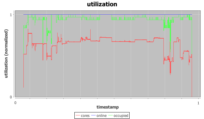
The utilization graph I’m using here is a time-series graph with time on the x-axis and three series plotted on the normalized y-axis: utilization of CPU cores by IaaS instances in red, occupancy of physical hosts by instances in green, and the (here irrelevant) power state of the physical hosts in blue.
Most helpful to our investigation is the red core utilization series. The trace indeed appears constant for most of the trace with a load spike plus a dip in the beginning, a short burst in the middle and another dip followed by a spike towards the end. The beginning of the trace is used as warmup-period for the machine learning scheduler and we’ll ignore it for now. The spike in the middle doesn’t throw off the scheduler, but the dip-spike formation towards the end matches with the timestamps of the observed SLA violation.
In more detail, both node utilization and node occupancy show an extreme outlier within the valley to the right. While our look at the utilization graph confirms that “something” is going on here, it is not immediately clear why this causes the scheduler to trip. After all, the load drops for a moment just to return back to normal levels.
(B) The lifetime graph
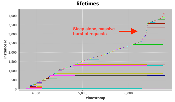
The lifetime graph integrates a large amount of information, so please bear with me for a moment. Time is plotted again on the x-axis while the y-axis represents the instance index (details below). Each horizontal row (“life-line”) represents the lifetime of a single IaaS instance, broken down into three phases: setup, execution, and tear down. Finally, the color-coding is connected to the requesting user, but not relevant for our investigation at hand.
Intuitively, the vertical ordering of rows can be interpreted as their launch order, i.e. instances closer to the bottom of the graph launched before instances towards the top. The horizontal indent of each row visualizes the absolute delay of the instance launch from the very beginning of the trace.
Even with the bare eye you can typically identify clusters of instances with similar start- and stop-times, as they tend to group together in the graph. Examples for this are the long green cluster and the long red cluster in the bottom half of the graph. If a number of these request clusters start or terminate at the same time stamp, such as right after time stamp 4.000, this is a strong indication for a change-point in system (or user) behavior. We can already observe that a number of long-running instances stop at the same time around the 7.000 mark, just when our SLA enforcement fails.
The final hint comes from the line created by newly added instance life-lines. For two thirds of the trace the “slope” generated by new lines is relatively even, indicating a constant arrival rate of requests at the could. This is what we would expect to see from the “constant” workload DS5 and DS6. At the 7.000 mark, however, the slope increases to almost vertical. This is the fingerprint of a massive burst of requests arriving at the cloud at once. Most of the launched instances only execute for a very short period of time and requests end up being issues quickly. This incident has the appearance of a runaway script that is supposed to replace some of the terminated long-running instances, but enters a rapid-fire request loop when failing to launch instances repeatedly.
The initial drop in load causes the scheduler to launch additional spot instances in the systems. While the runaway script ramps up its request rates, more and more spot instances are launched, just to be immediately terminated by a flood of high-priority requests. Armed with this knowledge we are able to solve the mystery of our failing scheduler. We modify it to detect drastic surges and stay at the side-lines until the situation normalizes. More importantly however, I hope that the visualization methods presented above will help you with your quest for building the perfect cloud or, at least, catastrophe-free schedulers. Happy hacking.


Hello Alex,
Nice analysis of trace data.
I am working with Hybrid cloud. (openstack and aws)
few queries :
1. If I want to generate traces how can I generate it?
2. At how you model traffic( http requests) ??
3. Any specific techniques to process workload and to do forcast??
Hi Vipul,
(1) You can approximate simple IaaS workloads with log-normal distributions for inter arrival time and duration. Of course, this skips over any other statistical properties found in real-world traces. I’ve linked a few public traces in another post.
(2) In this article “requests” are POST-requests to the cloud controller, i.e. “run-instance” commands in euca2ools. All the requests here were replayed from recorded traces.
(3) There’s a few decent load generators for benchmarking consumer-facing web apps. JMeter, Apache Bench, and httperf come to mind. For cloud infrastructure there’s SPEC cloud. You’ll also find pointers in recent papers from Facebook and Amazon.
Hope that helps.