Tag Archives: Cloud

Anomaly Detection is Easy

tl;dr Automated anomaly detection is the easy part. Detection performance matters, but system adoption is also driven by transparency, amenability to existing processes and change, and usability.

My work at LinkedIn’s Data Infrastructure group over the past year focused on anomaly detection and root-cause inference, specifically on integrating high-level business metrics with low-level system telemetry and external events. Our team builds ThirdEye, a monitoring and analytics platform for clouds and large distributed systems.

Personally, one of the major motivation for joining this effort was ThirdEye’s identity as a first-class open-source citizen that is deployed at scale in a production environment. ThirdEye sits on top of the remarkably powerful, and equally open-source, Pinot analytics platform for high-dimensional time series (Pinot in SIGMOD 18, LinkedIn Eng Blog). While ThirdEye also ties into a dozen different proprietary databases and APIs at LinkedIn, it is inherently useful even without these connectors.

It is great to see ThirdEye’s user community grow and to hear about use-cases and concerns about automated anomaly detection from many different perspectives. One standout observation is that anomaly detection and root-cause analysis on business metrics are, technologically, easy. There are numerous systems, both open and closed, that perform time series analysis, clustering, event correlation, etc. Yet, the vast majority of monitoring, even at large, modern Internet companies, still operates on manual thresholds, eyeballing, and simple rules of thumb.

In this article I want to explore some of the reasons why adoption of automated monitoring solutions isn’t as clear-cut a choice as the determined data scientist, software engineer, or product manager thinks. I certainly did. And apparently the title caught your attention too.

Onboarding

Every engineering team operating a particular service has their home-grown way of monitoring their system. There are company-specific APIs and standards, but typically the monitoring of system metrics is an afterthought when most effort goes into first shipping and then scaling and operating a new service.

Business metrics get generated via merging and transformation of different data sets. This leads to a loss of source information and and, by adding transformations and data cleaning, may also mask data valuable for detection and root cause inference. Additionally, the data pipelines typically still have delays of several hours (or days) as they have grown over a long time horizon and cannot easily be replaced by a single streaming solution.

Any anomaly detection platform requires data as a raw material however. Expecting prospective users to write (and maintain!) an addition ETL pipeline for the anomaly detection system is a big hindrance for adoption. Even worse, this pipeline may introduce additional delays, show numeric discrepancies, or become a source of instability by itself.

ThirdEye partially works around this by providing various system connectors, but in practice substantial effort is required to streamline and unify metric logging and processing. The upside here this is that tech companies typically attempt to unify and integrate their data pipelines anyways, especially during episodes of regulatory change such as the upcoming activation of the European GDPR.

Established processes

Critical systems and business metrics already have established processes for monitoring, reporting, and trouble shooting. Even if a new monitoring system can deliver better detection performance – in terms of recall – it will not be adopted trivially.

The entire reporting chain from operations staff, over managers, up to executives is organized based on established thresholds and severity measures. Changing these processes in a large established enterprise is a long and slow process.

A common example for this is the reliance on week-over-week numbers for comparison and reporting. There are numerous statistical methods to generate quantitative baselines that eliminate outliers, such as recent holidays or software deployments, from the comparison. Yet, alerts and reports require week-over-week numbers or else they are considered untrustworthy and useless for reporting purposes.

Automated root-cause analysis equally battles established run-books for trouble shooting. Even if we perform a correct analysis and determine, e.g. a hardware failure as the reason for an alert, a human typically still has to run through the steps in the run book as required. Cynically, from the perspective of established processes the value proposition for root-causes analysis mainly derives from the automation of leg work rather than finding the actual cause.

With ThirdEye we support algorithmic detection and autonomous root-cause inference but at the same time enable manual configuration of processes, outputs and detection rules. An interesting approach to driving process change is the parallel, comparative evaluation of established rules and algorithmic results. This helps users and management to build trust in detection performance and enables a gradual shift toward automated monitoring.

Desensitization

Sending out email alerts is easy. Filtering your email inbox is easy too. More invasive alerting such as paging or automated calls at 3:00 am are a sure ways to upset large numbers of operations staff and on-call engineers, especially if the alerts are identified as false alarms or received to the wrong person.

This is the aspect where alert precision matters the most. If the detection system sends out false alarms, or non-actionable alerts, they will be ignored very quickly and the system discarded as a nuisance. The worst thing that can happen in this scenario is the management insisting top-down on the use of a bad system. This has brought down entire projects, teams, and careers.

If addition to precise detection, however, we equally require an up-to-date view of recipients and responsibilities. Even a perfect detector becomes a nuisance if alerts are sent to the wrong person. This ties in with established processes, where different teams use different structures of on-call responsibilities, escalation structures, and investigation processes.

Finally, even if a monitoring solution performs on point and finds the correct recipients, a large wave of individual alerts should still be prioritized via grouping and ordering. Root-cause analysis can go a long way here to identify the most critical issues and common causes. We take the approach in ThirdEye to include basic root-cause information with the alerts. For example, drops in business metrics may be accompanied by recent holidays in affected regions. This helps our users to triage issues and minimize fatigue.

Transparency

One of the most consistent concerns I hear from users considering the adoption of ThirdEye, both inside and outside of LinkedIn, is a high-level question about how the system makes decisions about anomalies. Of course. Analysts, operators, and engineers have an intricate understanding of the systems, metrics and events they are monitoring on a daily basis.

Black-box algorithms have a hard time explaining which inputs matters how and whether the inferred relationships “make sense”. Users strongly prefer transparent solution they can understand intuitively. In my experience, it is overwhelmingly preferable to provide transparent but noisy results over opaque ones with higher accuracy. Root-cause analysis can alleviate part of this opaqueness, but detection algorithms themselves are typically the primary focus.

In my opinion, a big part of this ties back to established processes again. Ultimately, it is the human users who are held accountable for their system working as expected. If automated anomaly detection is to take over part of the monitoring effort, its decision making has to be transparent to be verifiable ahead of time, and explainable after the fact if it were not to perform as expected.

This has spawned a fascinating effort within the ThirdEye team to develop prediction and detection heuristics that are easy to understand intuitively, yet show strong performance when compared to “more rigorous” statistical tests and algorithms.  Many of these heuristics, such as seasonal median aggregation, are implemented in the open-source project and their performance can be evaluated in practice via parallel execution with other algorithms.

Stability

Existing rules and monitoring solutions have an established track record. While it may be spotty, users have already spent time and energy to adapt to it. The introduction of a new platform nixes this effort unless it can guarantee comparable results – at least in the beginning.

ThirdEye is under development and undergoes continuous scaling. This doesn’t go without friction all the time, especially for custom or cutting-edge features. If the monitoring system itself is shaky or does not function consistently with all types of monitoring data then users are quick to hesitate. This isn’t surprising, after all, the platform’s prime directive is monitoring other system’s reliability.

Another devious source of instability may be the data sources tapped by the monitoring platform. As users become familiar with the depth and variety of data available for detection and analysis, they will notice data being incoherent or unavailable intermittently. Unless the UI does a good job explaining that this is a problem at the source, they may conclude that the platform isn’t working correctly.

A final aspect of introducing a new platform is the education of users. Often a misunderstanding of the systems’ features can be perceived as system failure. Usability and user interface are crucial aspects, as are user training and trouble shooting resources. Even with this however, we still find ourselves investing substantial effort into helping out new users. User groups and interviews go a long way here as you may not even learn about perceived problems otherwise – such the use of abstract terms that remind of math or statistics, which can trigger visceral reactions.

We have taken ThirdEye a long way in terms of UI and user communication, and there does not seem to be an end in sight. Every iteration of the user interface broadens accessibility to larger groups of users and creates new challenges. Similarly, the documentation becomes increasingly detailed to cover numerous edge-cases and we invest massively in automated unit and end-to-end integration tests.

Change

The only constant is change. As the world and systems keep changing the definition of “normal” changes as well. Simple alerts and rules are easy to adapt. Expanding an experiment to twice as many users? Just double the traffic threshold. If alerting is driven by a supervised black-box algorithm, this may not be so easy.

Any data-driven detection system has a notoriously hard time adapting to changes in the outside world. Yes, there a techniques for automated change point detection. And yes, with enough integration with other systems we can add some degree of “intelligence”, such as expecting a doubling of traffic when doubling the scope of an automated A/B test. Despite this, the final authority on what represents a “new normal” usually is a human.

There must be efficient ways for a human to inform the system about expected changes before (and after) the fact. However, only relying on the “human in the loop” isn’t good enough either. A detection system quickly becomes a nuisance again when it requires dedicated feedback for each individual alert in case of changes. ThirdEye’s team has invested into learning from user feedback across alerts and domains. This is a challenging, but very interesting aspect of ongoing development.

Another type of change is the adoption of new technologies and processes throughout the organization. APIs change and systems are replaced. Teams merge and split. At scale it would be impossible for the engineering team of ThirdEye to keep up with all of this. We therefore provide numerous APIs and interfaces for others to connect to and plug-in their dedicated business logic. This is a delicate balance between stability and one-off solutions that re-invent the wheel for different teams. Here, an ongoing dialog with the user base is the only solution.


The development of ThirdEye, and research in anomaly detection and root-cause analysis at large, is an incredibly insightful journey cutting across a vast number of aspects of modern Internet businesses and technology. It is good to see numerous developers and research address these challenges. However, when diving deep into the technical details it is easy to ignore that the adoption of a new solution is driven by other aspects too. Ease of use, amenability to existing processes and change, and transparent operation are critical as well.
Creating Validated Simulation Models of IaaS Clouds

In a recent effort to empirically evaluate a newly-proposed power-aware scheduler for private IaaS clouds we ran into problems obtaining accurate simulation results for two cloud testbeds we were working with. This prompted us to investigate an approach for creating validated, yet light-weight simulation models using an approach inspired by Perturbation theory. The approach augments a simple cloud model with measurements taken from a small subset of an actual production system to produce highly accurate predictions at scale.

The “power manager” we investigate is designed to learn from and validate against production traces with multi-month time frames. The sheer duration of these traces makes it necessary to use faster-than-realtime simulation. Furthermore, we want to make predictions about the performance of the scheduler at larger scale than we can observe. Since we have to luxury of having access to two production-quality testbeds, we are also required to deliver a fully functional scheduler that handles workloads replayed on the real-world clouds flawlessly. This article is meant to be an accessible high-level How-To of our work on “Using Trustworthy Simulation to Engineer Cloud Schedulers” published at IC2E 2015.

Our primary goal is to build light-weight simulation models for our two specific private IaaS clouds to evaluate the power manager. These “clouds” have with 5 and 8 nodes, respectively, and are very small compared to commercial cloud installations. Due to their small size we have the opportunity to get away with a simple model while still achieving high accuracy. Having a production system at hand, we chose an approach inspired by Perturbation theory and start with a parsimonious model (“solvable”, e.g. simple model derived from the architecture overview diagram) of our cloud. We then iteratively perturb (“refine”) the model until the desired level of accuracy is achieved.

We lay out a minimal model with the end goal of evaluating the power manager in mind. The power manager draws on information on node occupancy and modifies the power states of individual nodes in our cloud. Hence, our simulation should accurately reproduce node utilization, occupancy, and power states and should allow for a plug-able scheduling algorithm and faster-than-realtime execution. Anything more than this is optional. Hence, we start with a simple model in which instance requests (and timer events) arrive at a scheduler which places instances on individual nodes. These instances then execute on the node for a fixed duration until they complete. Furthermore, the scheduler observes the system state in fixed intervals (epochs) and may hibernate and wake-up nodes as needed.

From experience working with clouds we also decide to run the simulation in a Monte-Carlo-style fashion which allows for non-determinism when it comes to state-transition times and failures in the system. This is necessary since multiple runs of the same workload – on the same cloud – are still subject to concurrency issues and tend to create similar but not necessarily equal results.

Our Perturbation approach then demands that we validate our model’s predictions at small scale – a single node in our case – against measurements of the real system. As expected, the prediction of the initial model diverge by a 15 percent margin and we enter our first round of iterative “perturbing” of the model. Looking at the logs of the production system versus the simulation, three types of unaccounted overheads stand out: instance setup, instance teardown and node power state changes. We extract these three overheads as variables for our model by storing their empirical distributions and later sampling them during the simulation. “Perturbing” our model by introducing these three variables indeed produces simulation results within 1 percent of the real 1-node cluster. But do these predictions hold when scaling up the simulation without collecting additional samples?

For the avid reader, the unsurprising answer to this question is “yes”. Even predictions made for our cloud with all 8-nodes validate against out-of-sample (i.e. later) measurements taken from the real-world system, with an error in the 1-2 percent range. Interestingly, this “cloud-specific” model for our 8-node cluster is trivially portable to the 5-node cluster and produces equally accurate results by swapping out the three empirical variables with measurements from a single node of the other cluster.

While these results are encouraging, a number of qualifications in order. Most importantly, scaling up a simple model cannot be expected to remain accurate for large systems. Shared resources such as network bandwidth or storage contention will put a cap on linear scaling sooner rather than later. Another aspect worth addressing is the assumption that nodes are homogeneous. Without this assumption, different nodes require different empirical distributions which increases model complexity and the required sample count. This may go to the extreme where each node is represented by it’s own samples, which defies the purpose of the approach. On the other hand, from a methodological perspective there are no restriction on “perturbing” the model further to account for these issues.

A practical takeaway of our Perturbation experiment is that it is indeed possible to build a simulation model that scales with the size of an implementation effort. The parsimonious simulation model is manually designed by the developer, which allows qualitative considerations, and augmented with empirical measurements, which adds quantitative information. The subsequent real-world testing of a component developed with the help of this perturbation model then generates new insights and empirical measurements at scale, which in turn can be fed back into the model by iterative “perturbing”.

Cloud Simulators for Research and Development

My personal interest lies in the area of scheduling and resource allocation in IaaS clouds. Evaluating the effectiveness of a new scheduling algorithm is often only visible in over a long period of time, with heavy load on the system. When working with production traces spanning multiple months, empirical evaluation in real-time becomes infeasible. The academic community has picked up on this issue and produced a large variety of simulators that allow evaluation of schedulers in faster-than-realtime. For a taxonomy of evaluation methods for large scale systems, I highly recommend you to have a look at a Gustedt et al. survey from 2009.

Looking specifically at the simulation approach, system evaluation is typically performed from a specific perspective – from the application or the infrastructure provider – and deliver accordingly tailored results. A subset of these simulators is presented below. Another, complimentary summary of existing work by Oujani can be found online as well.

Infrastructure simulators:

CloudSim. One of the primary frameworks used for simulating clouds in academic research. It is the brain-child of the developers of GridSim and has been used in a number of studies as it is highly customizable. Extensions to CloudSim include CloudAnalyst and NetworkCloudSim, which add a GUI and facilities for simulating geo-distributed applications, among others.

GreenCloud. Built on NS2 it’s primary focus lies on exploring the impact of network layouts on cloud performance and energy consumption.

iCanCloud. Focuses on predicting application performance, energy-consumption and cost with different hardware platforms and resource allocation schemes.

MDCSim. A commercial entrant in the area, relying on detailed models of individual hardware components to produce predictions about a clouds performance at scale. The original publication targets 3-tier web applications instead of generic IaaS cloud infrastructures.

DCSim. Simulates IaaS clouds with a specific focus on dynamic power- and SLA-optimization via VM migration. Its authors use tiered scale-out workloads and evaluate the advantage of VM migration and replication strategies over static provisioning.

GDCSim. Primarily concerned with the thermal aspects of power-management in data centers by integrating existing modeling tools. Specifically investigates the interaction of workloads intensity and resource management policies with heat dissipation and fluid dynamics of different physical data center layouts.

Application-perspective simulators:

PICS. A recent entrant in the cloud simulation field, with a focus on accurate reproduction of job execution times and cost on public clouds from traces.

EMUSim. Uses emulation of Bag-of-Task applications to extract performance properties and simulate their behavior at larger scale more accurately. An evaluation step ensures that emulation and simulation agree at observable scales.

These simulator are typically based on discrete-event simulation, using compound models from smaller sub-models. This approach makes them highly customizable, but creates a significant problem calibrating and validating them against real-world measurements. Notably, while application-perspective simulator are published with results to validate their accuracy against measurements taken from real-world execution, this is step appears to be missing for most infrastructure simulators. They are thus mostly applicable to exploratory research and design studies rather than exact performance prediction.

Visualizing Cloud Traces

We commonly need to debug an implementation of a new cloud component. While a torrent of error messages in the system logs communicates the fact that the experiment did not work the way it was intended to, it is harder to determine exactly why this is the case. This becomes especially bad when the cause isn’t a simple programming flaw, but an issue with the scheduling logic or algorithm itself.

A recent example for this was a scheduler which uses machine learning techniques to enforce SLAs, i.e. guarantees to the user of the instances, on the termination rates of evictable (“pre-emptible”) spot instances in IaaS clouds. In our model “spot instance” requests arrive at a cloud from “outside” and execute on spare capacity on the nodes. If the cloud receives high-priority “internal” instance requests which cause resource demand to spike, the spot instances are terminated to make room for more important ones. While I feel the itch to go on about the the scheduler in detail, I’ll rather focus on the problem at hand:

The scheduler performs smoothly for two thirds of a trace we chose for testing and then fails spectacularly, just to return to back to normal towards the end of the experiment. Of course, the primary goal now is to understand what is going on (and going wrong) in the cloud. In addition to the classic “CDF-everything” approach, I find that I frequently come back to two visualization methods for the dynamic behavior of cloud workloads – the utilization graph and the lifetime graph. Representing the inner workings of a cloud in a visual format helps me immensely to interpret the information quickly.

The following graphs are generated from the Eucalyptus private IaaS traces published recently, more specifically the “constant” workload data sets DS5 and DS6. These cloud workload traces are insofar interesting as they are recorded from commercial production systems and cover continuous multi-month time frames. Using the aforementioned types of graphs we will be able to dig up interesting details about the traces and solve the mystery of the failing SLA enforcement.

(A) The utilization graph

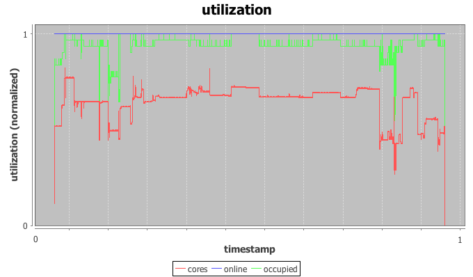
trace_utilization

The utilization graph I’m using here is a time-series graph with time on the x-axis and three series plotted on the normalized y-axis: utilization of CPU cores by IaaS instances in red, occupancy of physical hosts by instances in green, and the (here irrelevant) power state of the physical hosts in blue.

Most helpful to our investigation is the red core utilization series. The trace indeed appears constant for most of the trace with a load spike plus a dip in the beginning, a short burst in the middle and another dip followed by a spike towards the end. The beginning of the trace is used as warmup-period for the machine learning scheduler and we’ll ignore it for now. The spike in the middle doesn’t throw off the scheduler, but the dip-spike formation towards the end matches with the timestamps of the observed SLA violation.

In more detail, both node utilization and node occupancy show an extreme outlier within the valley to the right. While our look at the utilization graph confirms that “something” is going on here, it is not immediately clear why this causes the scheduler to trip. After all, the load drops for a moment just to return back to normal levels.

(B) The lifetime graph

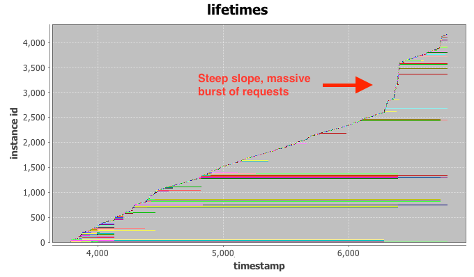
trace_lifetimes

The lifetime graph integrates a large amount of information, so please bear with me for a moment. Time is plotted again on the x-axis while the y-axis represents the instance index (details below). Each horizontal row (“life-line”) represents the lifetime of a single IaaS instance, broken down into three phases: setup, execution, and tear down. Finally, the color-coding is connected to the requesting user, but not relevant for our investigation at hand.

Intuitively, the vertical ordering of rows can be interpreted as their launch order, i.e. instances closer to the bottom of the graph launched before instances towards the top. The horizontal indent of each row visualizes the absolute delay of the instance launch from the very beginning of the trace.

Even with the bare eye you can typically identify clusters of instances with similar start- and stop-times, as they tend to group together in the graph. Examples for this are the long green cluster and the long red cluster in the bottom half of the graph. If a number of these request clusters start or terminate at the same time stamp, such as right after time stamp 4.000, this is a strong indication for a change-point in system (or user) behavior. We can already observe that a number of long-running instances stop at the same time around the 7.000 mark, just when our SLA enforcement fails.

The final hint comes from the line created by newly added instance life-lines. For two thirds of the trace the “slope” generated by new lines is relatively even, indicating a constant arrival rate of requests at the could. This is what we would expect to see from the “constant” workload DS5 and DS6. At the 7.000 mark, however, the slope increases to almost vertical. This is the fingerprint of a massive burst of requests arriving at the cloud at once. Most of the launched instances only execute for a very short period of time and requests end up being issues quickly. This incident has the appearance of a runaway script that is supposed to replace some of the terminated long-running instances, but enters a rapid-fire request loop when failing to launch instances repeatedly.

The initial drop in load causes the scheduler to launch additional spot instances in the systems. While the runaway script ramps up its request rates, more and more spot instances are launched, just to be immediately terminated by a flood of high-priority requests. Armed with this knowledge we are able to solve the mystery of our failing scheduler. We modify it to detect drastic surges and stay at the side-lines until the situation normalizes. More importantly however, I hope that the visualization methods presented above will help you with your quest for building the perfect cloud or, at least, catastrophe-free schedulers. Happy hacking.

Cloud Traces and Production Workloads for Your Research

Only interested in the raw trace data? Skip to the end.

(EDIT 2022-07-14: added Alibaba GPU and micro-services traces. H/T Yuyang Wang)
(EDIT 2022-07-14: added Chameleon Cloud traces. H/T Maël Madon)
(EDIT 2021-06-09: added new Azure Traces (2019, 2020, Serverless, DNN training). H/T Apoorve Mohan)
(EDIT 2021-06-09: added new Google Traces (2019). H/T Apoorve Mohan again, and again)
(EDIT 2021-06-09: add IBM docker registry paper. H/T Yue Cheng)

(EDIT 2021-06-09: Thank you to the many contributors and commenters! Without your help, this awesome collection wouldn’t have happened. Special thanks to Apoorve Mohan, Dachuan Huang, Saurabh Jha, Yue Cheng, and the folks at ResearchGate. Full change log at the bottom)

Whenever there’s a new idea for a cloud scheduler, my first step is a quick draft of the algorithm in an IaaS cloud simulation framework – punching out every idea on a production system simply isn’t feasible. The simulator then needs to be fed with platform configuration about system hardware and some type of utilization trace. The easiest type of workload trace to look at is generated from synthetic distributions, but this has some limitations. The traces we work with at minimum contain (a) job start times, (b) a type of job size such as duration or amount of data to process, and (c) a job type such as the instance type other form of constraint. When I speak of workload traces in this article, I am specifically referring to traces of batch jobs with fixed units of work. As an example, for one of our recent papers about SLA-enforcement for IaaS spot instances this means in detail:

  • request timestamp
  • instance life-time
  • instance core count
  • any additional data …

Generating realistic cloud workloads synthetically has spawned an entire branch of research. My focus in this article is rather a practical description of the steps I personally take for developing and evaluating a new cloud scheduler.

I usually start with a synthetic trace with job inter-arrival times and durations generated from an exponential distribution, with uniform core size – in our example a core count of 1 – for all requests. If the new scheduler doesn’t provide satisfactory results with this, it’s back to the drawing board. The next stage uses a log-normal distribution for arrival and duration, as this better models the long-tail properties of jobs encountered in real-world traces. A last extension for the synthetic traces then is the introduction of a non-homogeneous mix of instance sizes – which has been the demise of quite a few ideas. While the synthetic approach is a useful basic for testing, it does not re-create the kind of challenges that production traces pose, such as change-points in user-behavior, time-varying auto-correlation, and seasonality in the workload.

When a scheduler prototype enters serious consideration, I am a strong proponent of using traces recorded from production systems for evaluation. Unfortunately, this is where evaluation becomes difficult. Besides handling the technological complexity of the scheduler, a logistical problem comes up: the scarcity of publicly available production traces. This can be a big challenge for the aspiring cloud researcher. I’ve listed a number of notable exception below, but generally companies in the cloud space either do not record utilization traces over the long-term or they heavily guard these traces and rarely allow the interested researcher a glimpse. If researchers do get access, they often cannot name the source of the traces and cannot re-distribute the raw data used as foundation for their work. This in turn creates problems with the reproducibility of results and slows down the overall innovation process. The desire to protect a company’s competitive edge is understandable, and yet the availability of anonymized traces would spark innovation and drastically support academic research.

Fortunately, there are exceptions to this rule of scarcity. Here is a selection of public traces that we have found valuable in testing the real-world suitability of cloud schedulers:

Alibaba GPU traces. The released trace contains a hybrid of training and inference jobs running state-of-the-art ML algorithms. It is collected from a large production cluster with over 6,500 GPUs (on ~1800 machines) in Alibaba PAI (Platform for Artificial Intelligence), spanning the July and August of 2020.

Alibaba Micro-Services traces. The released traces contain the detailed runtime metrics of nearly twenty thousand microservices. They are collected from Alibaba production clusters of over ten thousand bare-metal nodes during twelve hours in 2021.

Chameleon Cloud traces. Data from OpenStack Nova/Blazar/Ironic services, as well as software to extract the appropriate data. The chameleon data spans samples from 2017 to 2020.

Azure Public Dataset. Very large trace of anonymized cloud VMs in one of Azure’s availability zones. Contains cpu and memory utilization plus deployment batch size. Cortez et al. analyze the original trace in their SOSP 17 paper. Microsoft keeps adding over time (2019, 2020, Serverless, DNN training).

Google cluster workload. Published by Google in an effort to support large-scale scheduling research, these traces from a Google data center cell have attracted analysis efforts from a number of researchers in the meantime, e.g. an analysis by Sharma et al.. The trace covers a 1-month time frame and 12.000 machines an includes anonymized job constraint tags. They added a new trace in 2019 as well.

IBM Docker Registry traces. More a server access trace rather than raw VM status, but increasingly relevant with the adoption of kubernetes and containerization. Anwar et al. published the matching paper at USENIX in 2018.

Blue Waters HPC traces. (uses LDMS) Cray Gemini torodial network traces from the NCSA’s Blue Waters cluster. Especially relevant for HPC networking studies. Jha et al. present the trace with their work on Monet.

Mustang and Trinity HPC traces. HPC cluster traces from Los Alamos National Labs. The Mustang trace is a smaller cloud-like trace with node counts and groups ids, whereas the Trinity trace comes from a large-scale super computer with backfill scheduler. G. Amvrosiadis et al. analyze the traces and summarizes the results.

Alibaba Cluster Trace Program. Data center traces for VMs with batch workloads and DAG information. Contains a 12 hour and a longer 8 days trace, with cpu and memory allocation. Lu et al. analyze the trace.

CERIT-SC grid workload. Traces from a cluster running cloud and grid applications on a shared infrastructure. Contains traces with resource foot print, instance groups, and allocated hosts. Klusácek and Parák analyze the trace.

TU Delft Bitbrains traces. Two data sets about VM allocation in a distributed data center focused on financial applications. One trace uses SAN storage, the other has a mixed population. Provides fine-grained cpu, memory, disk, and network utilization data over several weeks. Shen et al. analyze the trace. There are several other traces under “datasets”.

Eucalyptus IaaS cloud workload. Anonymized multi-month traces scraped from the log files of 6 different production systems running Eucalyptus private IaaS clouds. Published as part of a study by Wolski and Brevik. The traces contain start- an stop times for instances, their size and the node allocation as decided by the native scheduler. We added the traces from our IC2E 2015 paper on trustworthy cloud simulation as well.

Yahoo cluster traces. A number of data sets from Yahoo’s production systems. Most notably contains system utilization metrics from PNUTS/Sherpa and HDFS access logs for a larger Hadoop cluster. Additionally provides data sets with file access statistics and time-series for testing anomaly detection algorithms.

Cloudera Hadoop workload. (no trace) Similar to the above with data from production systems of anonymous Cloudera customers and Facebook and analyzed by researchers from UC Berkeley. Unfortunately, the raw data is not available.

OpenCloud Hadoop workload. Taken from a Hadoop cluster managed by CMU’s Parallel Data Lab, these traces provide very detailed insights in the workload of a cluster used for scientific workloads for a 20-month period. Includes timestamps, slot counts, and more. K. Ren et al. investigate the traces in depth.

Facebook Hadoop workload. A number of 1-hour segments from Facebook’s Hadoop traces published as part of UC Berkeley AMP Lab’s SWIM project. Some segments contain arrival times and duration, whereas others provide the amounts of data processed.

Notably, most of these traces stem from Hadoop clusters and are limited to data-mining applications. More generic IaaS-type workloads can be found in the Eucalyptus traces and, potentially, the Google trace. I want to emphasize that these are very different types of batch workloads that can offer interesting insights in the behavior of a cloud system under varying conditions. I hope this short reference provides a jump-off point for both researchers and engineers to get their hands on a broader variety of production traces.

Change Log

(EDIT 2022-07-14: added Alibaba GPU and micro-services traces. H/T Yuyang Wang)
(EDIT 2022-07-14: added Chameleon Cloud traces. H/T Maël Madon)
(EDIT 2021-06-09: added new Azure Traces (2019, 2020, Serverless, DNN training). H/T Apoorve Mohan)
(EDIT 2021-06-09: added new Google Traces (2019). H/T Apoorve Mohan again, and again)
(EDIT 2021-06-09: add IBM docker registry paper. H/T Yue Cheng)
(EDIT 2021-06-09: move change log to the bottom)
(EDIT 2020-02-03: added Blue Waters HPC network traces. H/T Saurabh Jha)
(EDIT 2019-07-04: added Mustang and Trinity HPC traces. H/T Apoorve Mohan, again)
(EDIT 2019-03-11: added Azure and Alibaba traces. H/T Apoorve Mohan)
(EDIT 2018-02-21: added TU Delft Bitbrains and CERIT-SC traces. Via ResearchGate)
(EDIT 2017-08-01: added traces from our IC2E 2015 paper “Using Trustworthy Simulation to Engineer Cloud Schedulers”)
(EDIT 2015-09-15: added Yahoo cluster traces. H/T Dachuan Huang)