Tag Archives: Visualization

Crunching Numbers Comfortably with IPython Notebook and Pandas

A big part of building distributed computer systems is delivering proof they actually work. Besides a live demo with shiny front-end and a polished slide deck, raw numbers are ultimately necessary to show that promises of robust availability, high throughput and low latency are kept during real-world use. And sometimes you may need numbers for debugging as well.

My clear personal favorite for data analysis and visualization (and light programming) is Python, and in extension IPython Notebook, matplotlib, seaborn and the time-series analysis framework Pandas. Their integration has become seamless over the past years and they are very well suited for pretty much any task from quickly visualizing application logs to in-depth looks at time series and performing statistical inference. As examples for successful use of these tools I can offer our recent work on validated simulation of IaaS clouds and SLAs for spot instances. When looking closely at these publications the astute reader will find the giveaways of graphs generated with these tools.

If you haven’t used IPython notebook yet, I highly recommend you invest 1-2 hours in getting familiar with the basics. Personally, it took some time to overcome my internal inertia and finally spend the time necessary – and I haven’t looked back since. It makes life quite a bit easier. I also had the opportunity earlier this year to talk to Brian Granger – one of the master minds behind IPython – and heard about the plans for expanding IPython’s scope with project Jupyter. I’m excited to see what’s coming down the pipeline in terms of high-performance analytics for those lengthy production log files we have sitting around.

Pandas had a steep learning curve for me as well, but it took some time to get my head around some of the intermediate indexing and slicing techniques. As I figured this out, however, productivity shot through the roof. Importing text, csv, json and xml? No problem. Join three different data sets on different columns and get aggregate statistics a la SQL? Check. Plot intermediate results to debug heavy scipy use? Quick and easy. Things that took hours before get done in minutes now. It was well worth spending an afternoon to get familiar with it.

Despite all this greatness, there’s a caveat. For presentation slides I still find myself falling back on Microsoft Excel for most visualization. Yes, I know my coolness factor just took a hit. The WYSIWYG (“what-you-see-is-what-you-get”) formatting capabilities are still more time-efficient than figuring out the various corner-cases of matplotlib calls. That being said, I usually prepare the data plotted with Excel using the aforementioned Python tools.

Probably the easiest way to get it all set up is a pre-configured Python distribution such as Continuum Anaconda. An installation from scratch with pip and co is possible as well, but depending on your platform you will end up dealing with version conflicts manually. In case you run into any roadblocks there’s a solid user base for all these tools. This means that stackexchange.com is an invaluable resource for troubleshooting in addition to the official IPython and Pandas docs.
Visualizing Cloud Traces

We commonly need to debug an implementation of a new cloud component. While a torrent of error messages in the system logs communicates the fact that the experiment did not work the way it was intended to, it is harder to determine exactly why this is the case. This becomes especially bad when the cause isn’t a simple programming flaw, but an issue with the scheduling logic or algorithm itself.

A recent example for this was a scheduler which uses machine learning techniques to enforce SLAs, i.e. guarantees to the user of the instances, on the termination rates of evictable (“pre-emptible”) spot instances in IaaS clouds. In our model “spot instance” requests arrive at a cloud from “outside” and execute on spare capacity on the nodes. If the cloud receives high-priority “internal” instance requests which cause resource demand to spike, the spot instances are terminated to make room for more important ones. While I feel the itch to go on about the the scheduler in detail, I’ll rather focus on the problem at hand:

The scheduler performs smoothly for two thirds of a trace we chose for testing and then fails spectacularly, just to return to back to normal towards the end of the experiment. Of course, the primary goal now is to understand what is going on (and going wrong) in the cloud. In addition to the classic “CDF-everything” approach, I find that I frequently come back to two visualization methods for the dynamic behavior of cloud workloads – the utilization graph and the lifetime graph. Representing the inner workings of a cloud in a visual format helps me immensely to interpret the information quickly.

The following graphs are generated from the Eucalyptus private IaaS traces published recently, more specifically the “constant” workload data sets DS5 and DS6. These cloud workload traces are insofar interesting as they are recorded from commercial production systems and cover continuous multi-month time frames. Using the aforementioned types of graphs we will be able to dig up interesting details about the traces and solve the mystery of the failing SLA enforcement.

(A) The utilization graph

trace_utilization

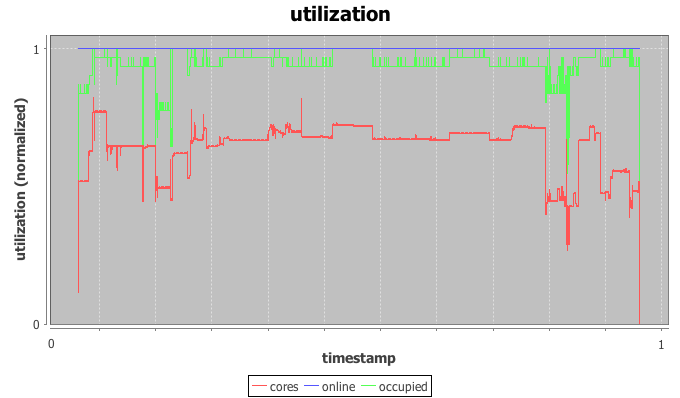
The utilization graph I’m using here is a time-series graph with time on the x-axis and three series plotted on the normalized y-axis: utilization of CPU cores by IaaS instances in red, occupancy of physical hosts by instances in green, and the (here irrelevant) power state of the physical hosts in blue.

Most helpful to our investigation is the red core utilization series. The trace indeed appears constant for most of the trace with a load spike plus a dip in the beginning, a short burst in the middle and another dip followed by a spike towards the end. The beginning of the trace is used as warmup-period for the machine learning scheduler and we’ll ignore it for now. The spike in the middle doesn’t throw off the scheduler, but the dip-spike formation towards the end matches with the timestamps of the observed SLA violation.

In more detail, both node utilization and node occupancy show an extreme outlier within the valley to the right. While our look at the utilization graph confirms that “something” is going on here, it is not immediately clear why this causes the scheduler to trip. After all, the load drops for a moment just to return back to normal levels.

(B) The lifetime graph

trace_lifetimes

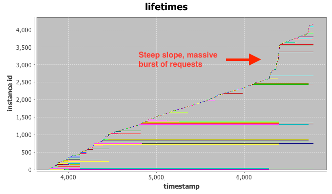
The lifetime graph integrates a large amount of information, so please bear with me for a moment. Time is plotted again on the x-axis while the y-axis represents the instance index (details below). Each horizontal row (“life-line”) represents the lifetime of a single IaaS instance, broken down into three phases: setup, execution, and tear down. Finally, the color-coding is connected to the requesting user, but not relevant for our investigation at hand.

Intuitively, the vertical ordering of rows can be interpreted as their launch order, i.e. instances closer to the bottom of the graph launched before instances towards the top. The horizontal indent of each row visualizes the absolute delay of the instance launch from the very beginning of the trace.

Even with the bare eye you can typically identify clusters of instances with similar start- and stop-times, as they tend to group together in the graph. Examples for this are the long green cluster and the long red cluster in the bottom half of the graph. If a number of these request clusters start or terminate at the same time stamp, such as right after time stamp 4.000, this is a strong indication for a change-point in system (or user) behavior. We can already observe that a number of long-running instances stop at the same time around the 7.000 mark, just when our SLA enforcement fails.

The final hint comes from the line created by newly added instance life-lines. For two thirds of the trace the “slope” generated by new lines is relatively even, indicating a constant arrival rate of requests at the could. This is what we would expect to see from the “constant” workload DS5 and DS6. At the 7.000 mark, however, the slope increases to almost vertical. This is the fingerprint of a massive burst of requests arriving at the cloud at once. Most of the launched instances only execute for a very short period of time and requests end up being issues quickly. This incident has the appearance of a runaway script that is supposed to replace some of the terminated long-running instances, but enters a rapid-fire request loop when failing to launch instances repeatedly.

The initial drop in load causes the scheduler to launch additional spot instances in the systems. While the runaway script ramps up its request rates, more and more spot instances are launched, just to be immediately terminated by a flood of high-priority requests. Armed with this knowledge we are able to solve the mystery of our failing scheduler. We modify it to detect drastic surges and stay at the side-lines until the situation normalizes. More importantly however, I hope that the visualization methods presented above will help you with your quest for building the perfect cloud or, at least, catastrophe-free schedulers. Happy hacking.